Course compass
Guiding question: How do we turn measurements into a picture that honestly shows what changes?
1 — The physical question
How do we turn measurements into a picture that honestly shows what changes?
We start from the concrete problem before notation. The goal is to understand what we seek, then why mathematics becomes useful.
2 — How to read the symbols and units
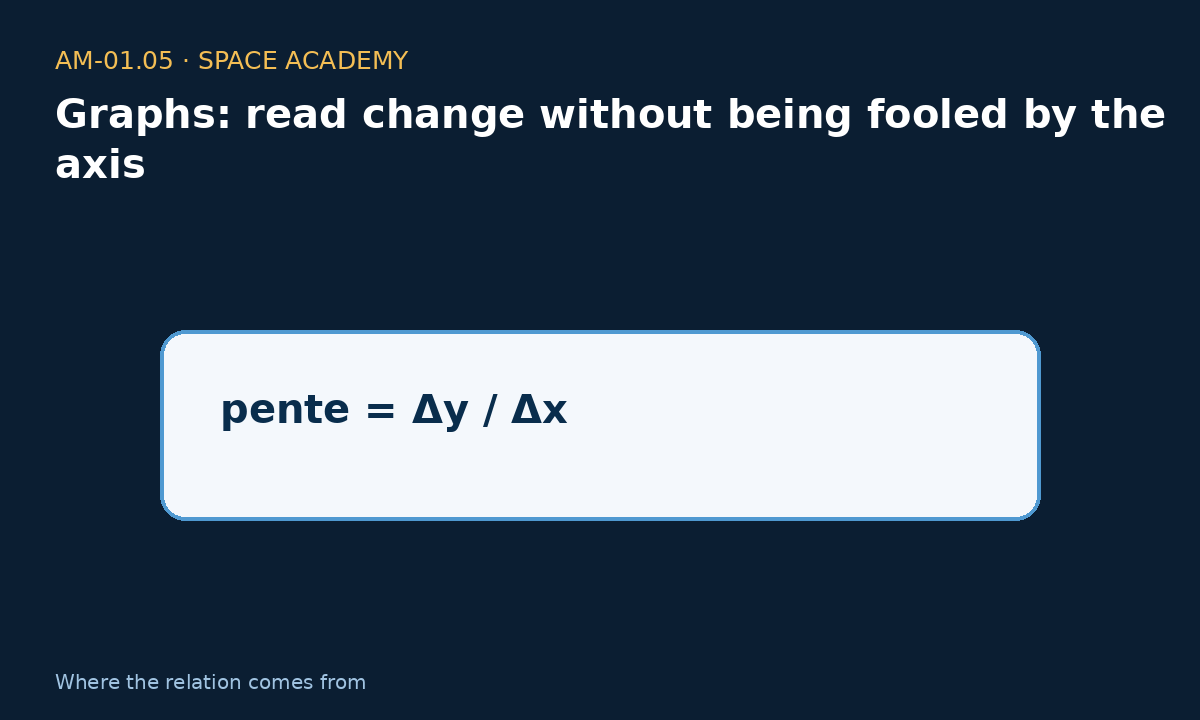
pente = Δy / Δx. Read: “slope equals delta y divided by delta x”.
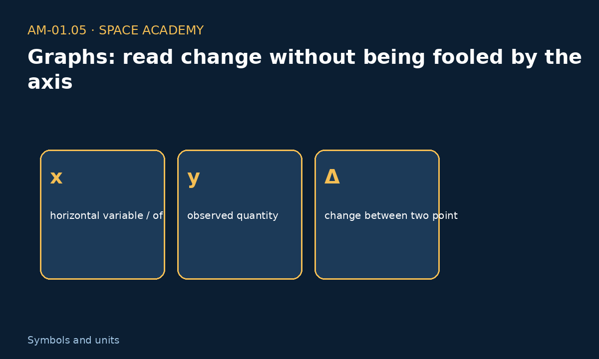
x — horizontal variable / often time ; y — observed quantity ; Δ — change between two points
3 — Where does the relation come from?
A graph places one quantity on horizontal axis x and another on vertical axis y. Slope compares how much y changes when x changes. Symbol Δ, read “delta”, means a change between two values.
Every number used below is explicitly treated as data, convention, learning assumption, or calculated result.
4 — A — Water level
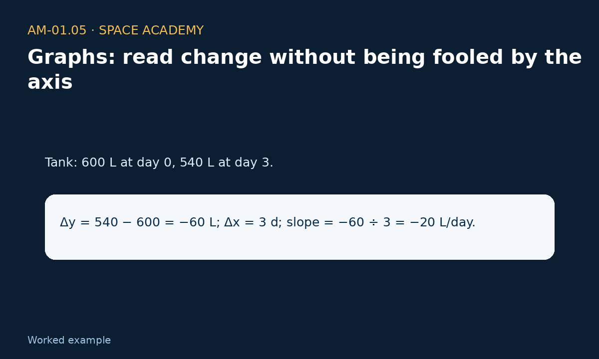
Where do the numbers come from? Tank: 600 L at day 0, 540 L at day 3.
Step-by-step calculation: Δy = 540 − 600 = −60 L; Δx = 3 d; slope = −60 ÷ 3 = −20 L/day.
The minus sign means the reserve is decreasing.
5 — B — Solar power
Where do the numbers come from? 18 kW at 10:00, 27 kW at 13:00.
Step-by-step calculation: Δy = 9 kW; Δx = 3 h; slope = 3 kW/h.
Average slope does not say the increase was perfectly steady.
6 — C — Misleading axis
Where do the numbers come from? Temperature 19.8 °C then 20.2 °C.
Step-by-step calculation: Actual change = +0.4 °C. An axis starting at 19.7 can visually exaggerate this small change.
Always read axis values before judging curve shape.
7 — Sensitivity, inverse calculation, and sanity check
Change one input, predict the direction of the result, calculate, then check units, sign, order of magnitude, and limits.
Essential limit for Graphs: read change without being fooled by the axis: the displayed relation is a learning model. A real system adds detailed geometry, variable properties, sensors, uncertainty, transients, and testing.
8 — Why this matters in a mission
In a space mission, how do we turn measurements into a picture that honestly shows what changes? The useful skill is not reciting the formula but knowing which data are needed, which are measured, and when the model becomes insufficient.
10 — Go deeper: from calculation to physical understanding
How a graph can tell a false story without containing one false number
A graph is not merely a picture; it is a framing choice. A temperature curve rising from 19.8 to 20.2 °C can look dramatic if the vertical axis starts at 19.7 °C and almost flat if the axis runs from 0 to 100 °C. Both drawings can use exactly the same measurements. Before interpreting the curve, the reader must inspect axis origins, scale, units, tick spacing, and any axis breaks.
In mission control, slope becomes an alarm
Imagine a water reserve falling by 20 litres per day. The absolute level tells us what remains; the slope tells us how fast the situation is deteriorating. If the slope suddenly changes from -20 to -60 litres per day, the problem has changed even if a large volume remains. Combining level, trend, and remaining time turns a simple graph into a decision tool.
Average does not mean continuous behaviour
A slope calculated between two points is an average slope. Between 10:00 and 13:00, solar power may rise from 18 to 27 kW without increasing by exactly 3 kW every hour: dust, orientation changes, or electrical limits can create intermediate variations. The farther apart the measurements are, the more the graph may hide what happened between them.
Beginner question: why connect the dots?
Drawing a segment between two measurements does not mean the quantity truly followed that straight line. It is a convenient representation. If the phenomenon can change rapidly, measurements must be more frequent or the points should be shown without pretending to know everything between them. The reader must distinguish measured data, graphical interpolation, and a physical model.
9 — Exercises and answers
Challenge 1
Tank: 600 L at day 0, 540 L at day 3.
Challenge 2
18 kW at 10:00, 27 kW at 13:00.
Challenge 3
Temperature 19.8 °C then 20.2 °C.